ABMS(Redesigning Benefit Management system)

Project Overview
ABMS is a modernization initiative aimed at improving usability and efficiency within Accenture’s internal benefits management portal. I led the redesign of key modules, focusing on streamlining workflows and creating a cohesive design system.
Project Type
Client Project
Role
UI/UX, Website Design
Date
Sept 2023 - Nov 2024
Tools
Figma, Fig jam, Sharepoint, Miro, JIRA
Focus Area
Focus of the ABMS (Accenture Benefit Management System) project was to modernize and enhance the user experience of the existing portal used by internal teams for benefits management. The goal was to streamline workflows, reduce user friction, and create a unified, accessible, and visually consistent interface across all modules.
Current System Limitations
The existing Accenture Benefits Management System (ABMS) does not meet modern UX and UI standards expected by state clients and caseworkers who rely on it daily.
Poor user experience and outdated interface design were creating significant operational challenges
Extended case processing times affecting service delivery
Reduced competitiveness in state procurement processes
Declining caseworker satisfaction and productivity
Barriers to new state client acquisition
Design Process Followed

Empathize
Define
Ideate
Design
Test
The design process followed a disciplined yet flexible methodology that balanced strategic thinking with tactical execution.
Each phase built upon insights from the previous stage, ensuring designs were grounded in real user needs and validated through continuous testing.
Research Phase
Empathizing and understanding caseworker needs for ABMS
Heuristic analysis
Comprehensive evaluation of current ABMS interface against established usability principles
Stakeholder interviews
In-depth conversations with caseworkers from Kansas and Ohio to identify pain points
Prioritization workshop
Collaborative session to rank improvement opportunities by Impact and feasibility
Usability testing
Two rounds of iterative testing across Kansas, Ohio, and lowa to validate design decisions
The 2-month discovery phase culminated in a detailed product backlog with prioritized short- and long-term improvement recommendations, providing a strategic roadmap for the design track.
Key Pages and Flows
Through iterative design and continuous refinement, I delivered comprehensive solutions for the most critical user journeys in the ABMS system:
Paper Application Flow
E-change Flow
Case Linking and Unlinking Flow
Component Mapping
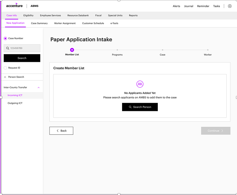
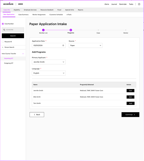
Paper Application Flow
How The flow works today -
The paper application flow enables case workers to create and process applications received offline by identifying or adding a person, assigning relevant programs, creating a case application, and routing it to the appropriate worker for completion.
Redesigned Experience
Why this is better UX
Builds confidence after each action
Prevents second-guessing
Keeps users oriented in long workflows


Explore Other Redesigned Modules - To see the full redesign across additional modules, watch the walkthrough video where I explain the complete solution and design decisions.
Old Experience Before
Long, fragmented workflow
High cognitive load
Manual validation & error risk
Weak system feedback
Key Insight
The system lacked guidance and feedback in a high-stakes workflow.
The biggest issue wasn't the number of steps - it was the lack of guidance, feedback, and confidence throughout those
The redesigned paper application flow transforms fragmented, error-prone process into a guided, step-based experience that reduces cognitive load, improves clarity, and builds user confidence at every stage.
Empty state clearly explains what to do next
Single, prominent Search Person CTA
Step indicator shows where the user is
UX principles followed
Guidance & affordance
Visibility of system status
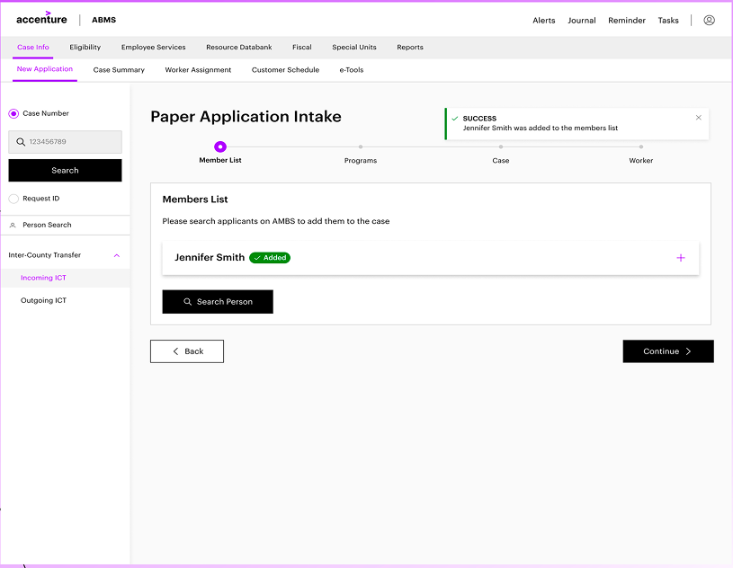
Progressive member addition with strong feedback
What changed
Members are added incrementally
Each addition is confirmed with:
Success toast
Added" status chip
Users can add multiple members without losing context
UX principles followed
Feedback
Recognition over recall
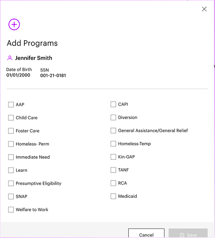
Structured program selection
What changed
Program step is clearly separated
Programs are added per member via focused modal
Selected programs are clearly visible and editable
Why this is better UX
Users don't have to remember what they selected
Safer decision-making for high-impact choices
Clear mental model: who → which programs
UX principles followed
Cognitive load reduction
error prevention
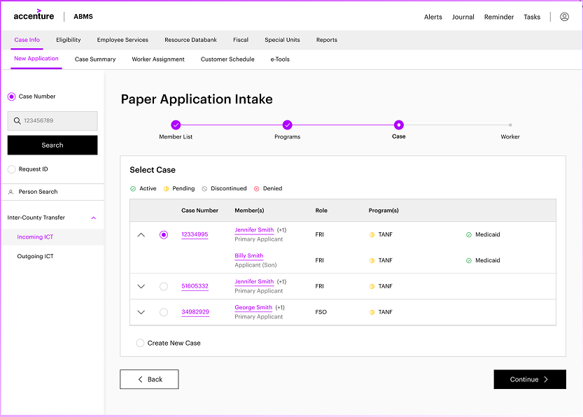
Step-by-step flow with progress visibility
Clear stepper: member → programs → case → worker
Completed steps are visually acknowledged
Navigation feels linear and predictable
Why this is better UX
Long flow feels manageable
Reduces anxiety and fatigue
Users always know what comes next
UX principles followed
Visibility of system status
Wayfinding
Simplified worker assignment
What changed
Only relevant programs shown
Clear choice between automatic vs manual assignmentAssignment confirmation shown inline
Why this is better UX
Reduces configuration overload
Prevents incorrect setup
UX principles followed
Progressive disclosure
Simplicity
Clear case summary & confirmation
What changed
Case summary organized into clear sections
Status indicators (Active, In Progress)
All critical info visible in one place
Why this is better UX
Errors are easier to spot
Builds trust before closing the task
Reduces need to go back and recheck
UX principles followed
Confirmation before commitment
Error recovery
Impact & outcomes (executive summary)
Simplified workflows reduced cognitive load and improved focus on critical tasks.
25% faster task completion through fewer clicks and streamlined processes.
20% productivity increase, enabling users to process more cases in the same time.
20% faster linking/unlinking with 15% fewer errors due to better validations. 4.7/5 user satisfaction, with feedback highlighting clarity and ease of use.
20—25% Lower drop of rates as compared to earlier experiences
User feedback
The redesigned interface feels modern and much easier to use.
Case linking and unlinking are now effortless, and the process is more transparent.
Thanks to the team :)