Verizon – M+H (Mobile + Home) Bundle Portfolio
Identifying UX gaps and driving research-led improvements
Role
UX Designer
Timeline
6 Months
Design tool used
Figma, Miro,Figjam, Quantam Metrics (for heatmaps) , Lookback, Adobe Analytics
Focus
Research & Discovery
Project Overview
As part of the Verizon M+H (Mobile + Home) bundle team, I worked on understanding customer behavior, identifying experience gaps, and defining UX problems across the M+H bundle portfolio.
This project was primarily focused on research synthesis, problem discovery, and experience evaluation, with selective UI improvements in areas where clarity could be immediately improved.
Rather than jumping into redesigns, the goal was to define the right problems first, backed by data and research, so future design solutions could be more effective.

My Role & Ownership
What I Owned
Persona creation for M+H bundle customers based on research insights
End-to-end identification of UX problems across the M+H bundle journey
Analysis of user behavior using:
CMI research insights
Heatmap analysis
Adobe Analytics data
Heuristic evaluation of identified issues
Documentation of problem flows in Figma
Selective UI improvements for a few high-impact screens
While UI redesign was not the primary scope, I took ownership of improving specific screens where clarity and usability issues were evident.
Understanding the Problem Space
The M+H bundle portfolio spans multiple entry points and decision moments where customers need to:
understand bundle benefits
compare plans
feel confident about eligibility and pricing
Initial observations showed high drop-offs, hesitation, and confusion, especially during plan exploration and bundle evaluation.

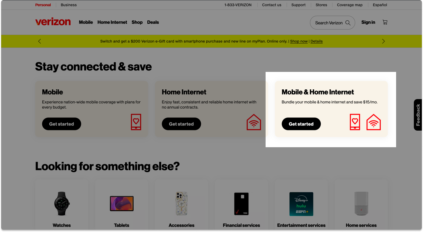
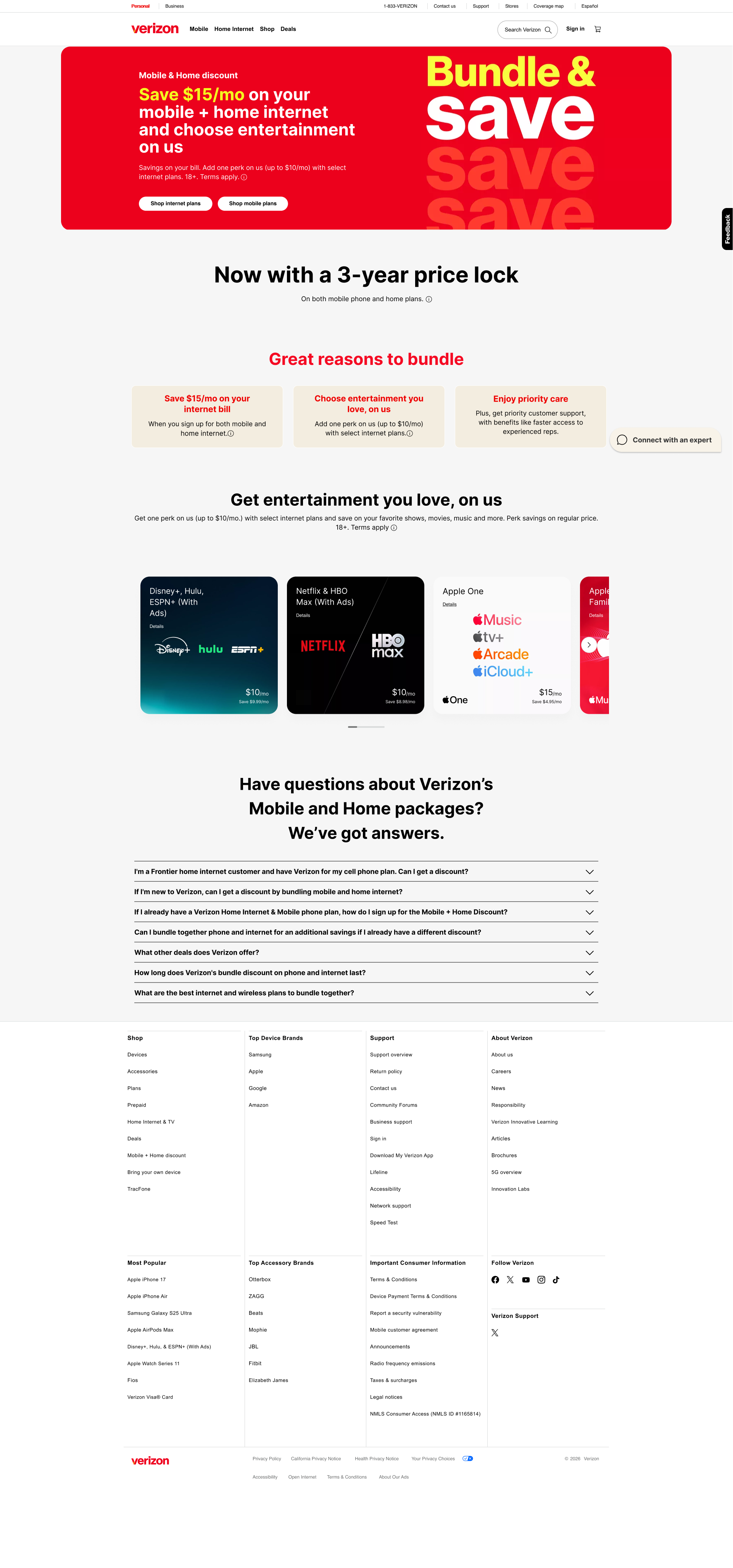
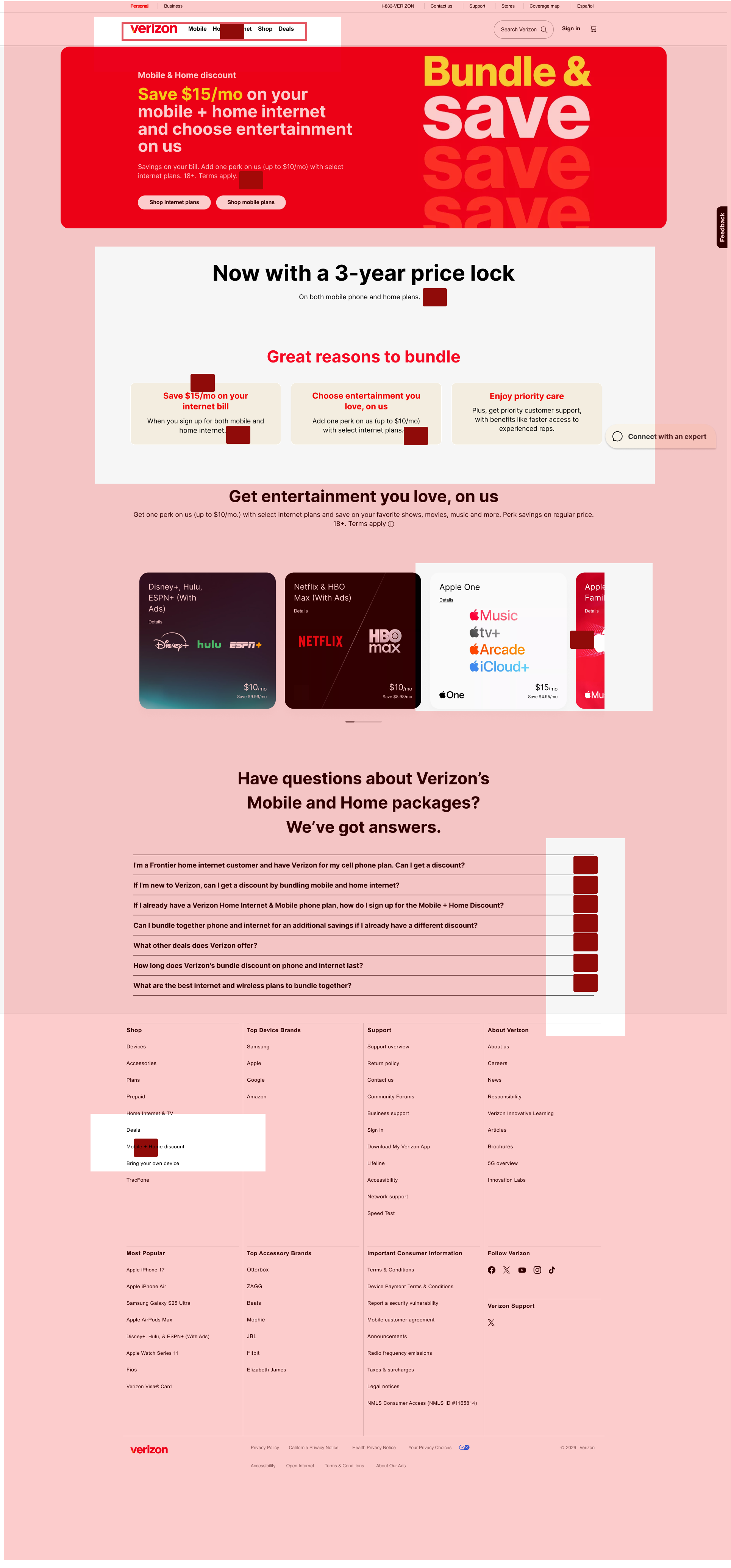
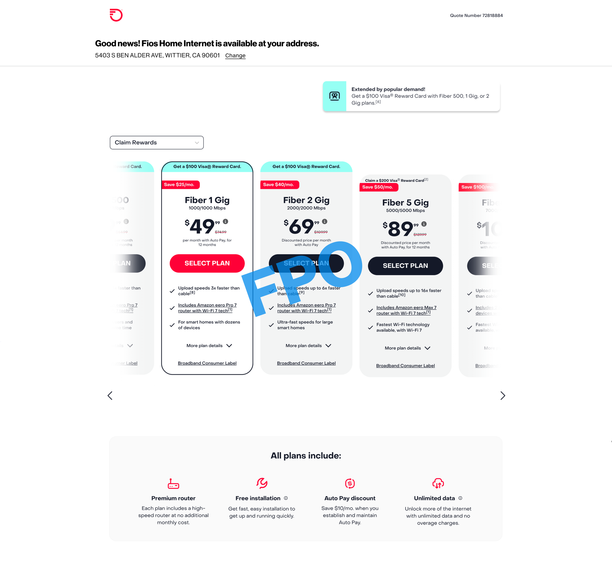
A key issue we identified was that the bundle offer tile was positioned deep down the homepage. This meant users had to scroll a lot before encountering it.
Based on typical user behavior, most users don’t scroll that far, which significantly reduced the visibility and effectiveness of the “Combine Mobile + Home Internet and save X%” message.
Research Inputs Used
To avoid assumption-based decisions, I worked with multiple research inputs:
CMI Research Insights
Provided qualitative understanding of:
customer expectations from bundles
confusion around plan differences
trust and pricing concerns
Heatmap Analysis
Helped identify:
Click patterns revealing confusion
areas with high interaction but low conversion
content that failed to attract attention
Spot Tests
Revealed where users:
Hesitated
Misunderstood terminology
dropped off before completing actions
Adobe Analytics
Drop-off rates at key steps
Conversion funnel bottlenecks
Persona Creation
Based on research insights, I created M+H bundle personas that captured:
customer goals when choosing bundled plans
decision drivers (price, convenience, clarity)
pain points during comparison
moments of hesitation and confusion
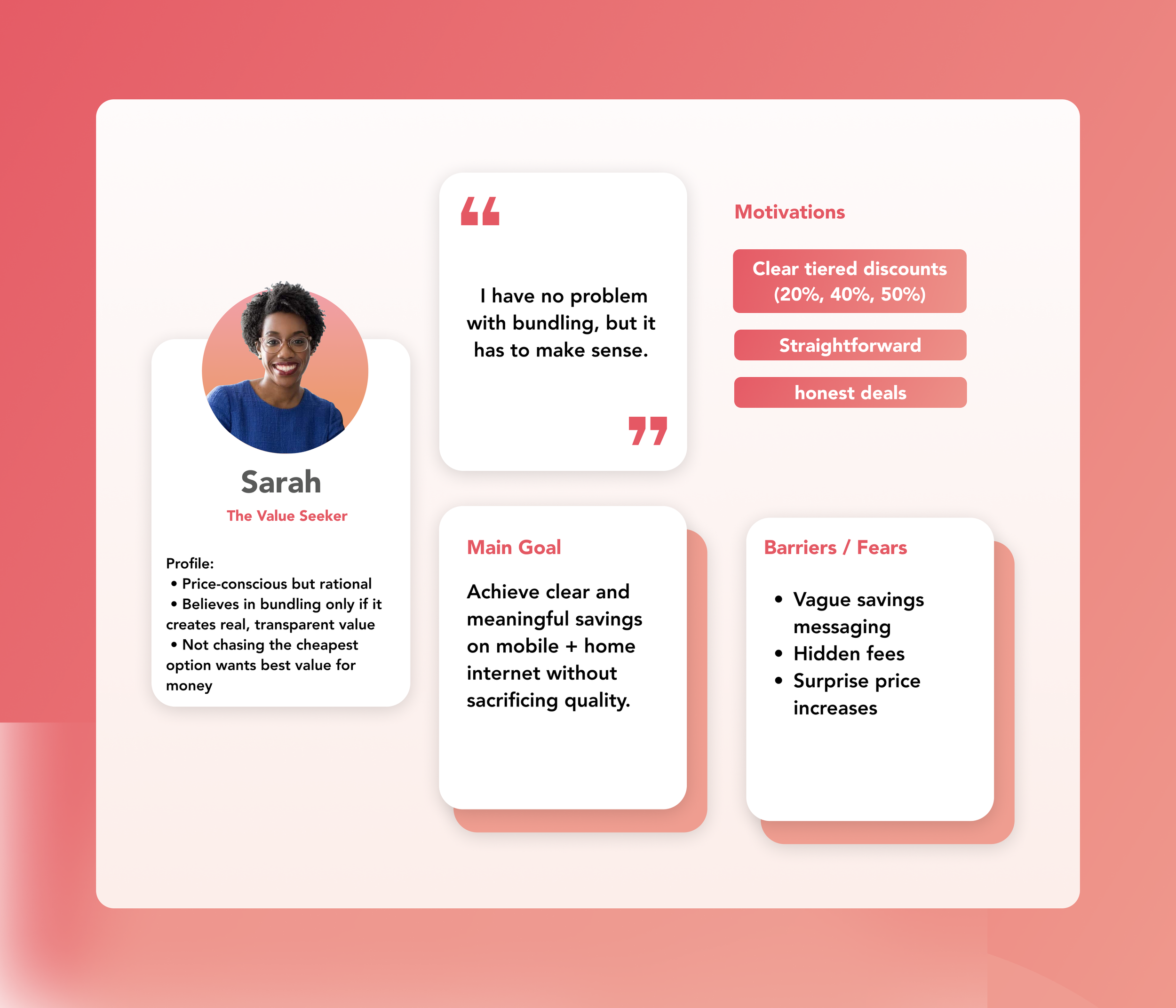
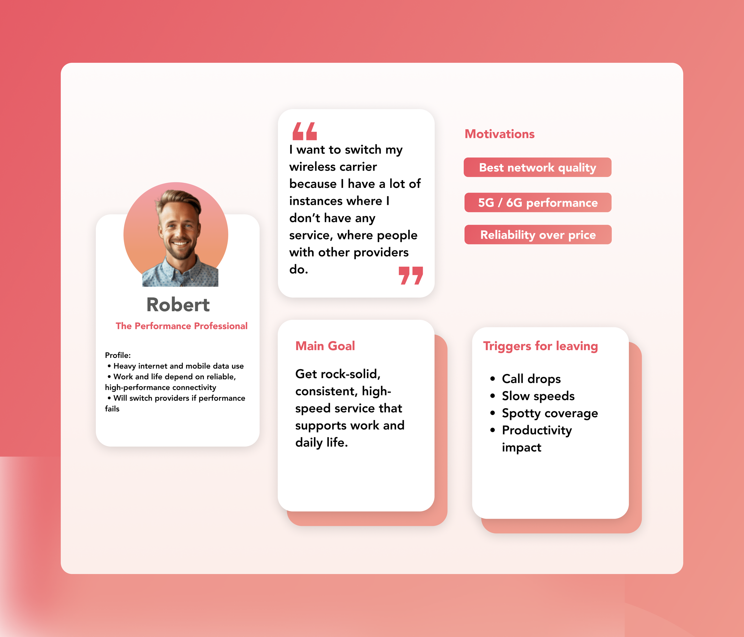
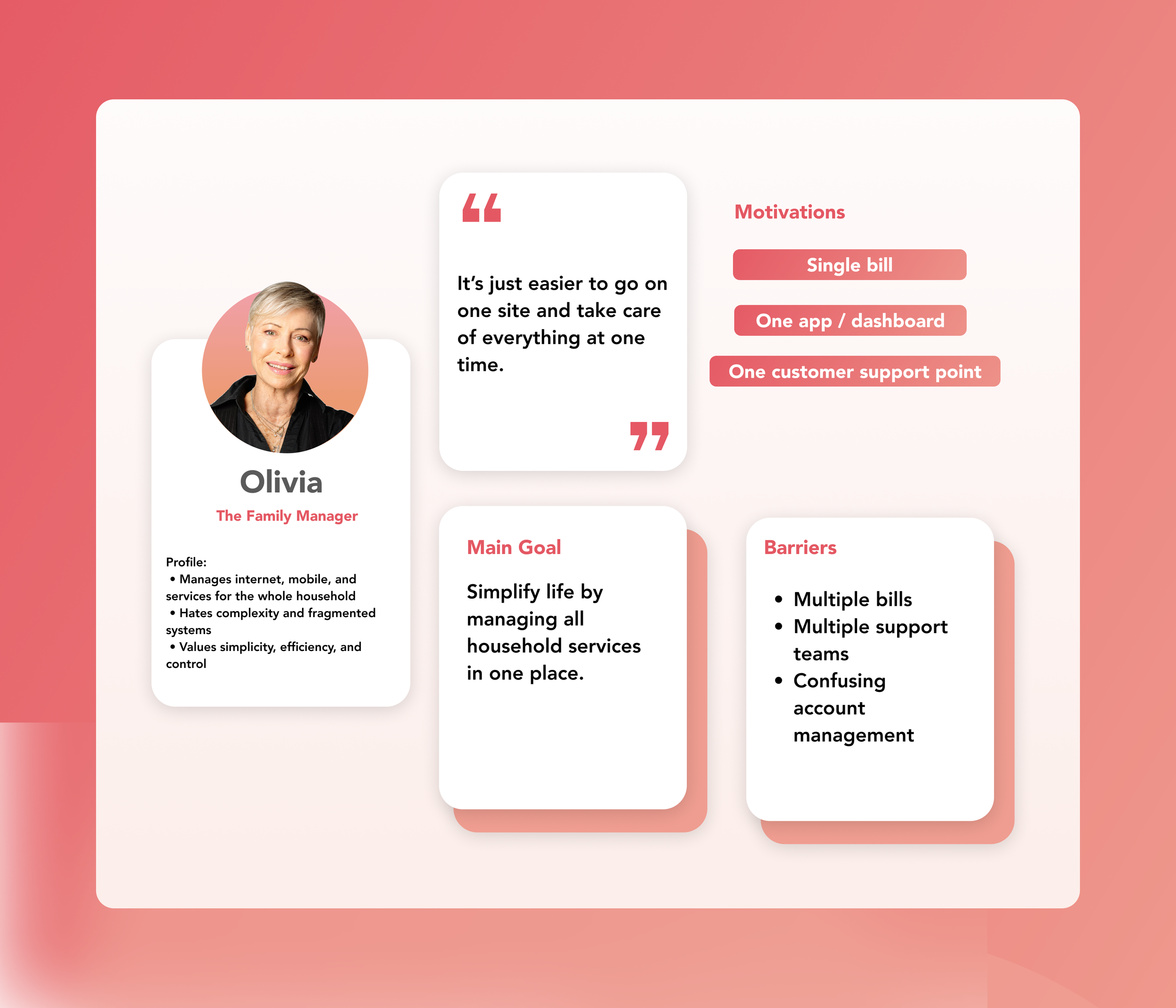
Personas helped align stakeholders around real customer behavior and served as a reference point while identifying and prioritizing UX issues.
Problem Identification (Core Contribution)
I took ownership of identifying UX problems across the M+H bundle journey.
What I Did
Audited key M+H portfolio pages
Mapped the end-to-end customer journey
Identified friction points across:
entry points
plan discovery
bundle comparison
Information clarity
Each problem was:
validated with research or analytics
evaluated using UX heuristics
prioritized based on impact and frequency
This resulted in a clear, prioritized list of UX issues.

Heuristic Analysis & Flow Documentation
For every major issue identified, I:
Conducted heuristic analysis using principles like:
• clarity
• consistency
• recognition over recall
• error prevention
Documented the existing problematic flows in Figma Highlighted:
• where users struggled
• why the experience broke down
• what needed to improve
Why this was valuable
• Created a shared understanding across design, product, and research teams
• Reduced ambiguity before moving into solutioning
• Made future design work faster and more aligned
M+H - Sequential Transaction (Mobile + FIOS) - Heuristic Evaluation
MLP - Entry Point
M+H - MLP (Entry Point) - Heuristic Evaluation


M+H - Joint Transaction (Mobile + FWA) - Heuristic Evaluation

Impact of My Work
Established a strong UX foundation for future design improvements
Enabled teams to focus on validated, high-impact problems
Reduced ambiguity in complex M+H bundle flows
Improved cross-team alignment using shared research and documented flows
The project shifted conversations from “what should we design” to “what problem are we solving and why.”
Key Learnings
Strong UX starts with problem definition, not visuals
Combining research, analytics, and heuristics leads to better decisions
Data-backed insights improve stakeholder alignment
Clear documentation is critical in large, complex product ecosystems
This role strengthened my ability to own UX problem discovery, translate research into actionable insights, and lay a clear foundation for meaningful design solutions.
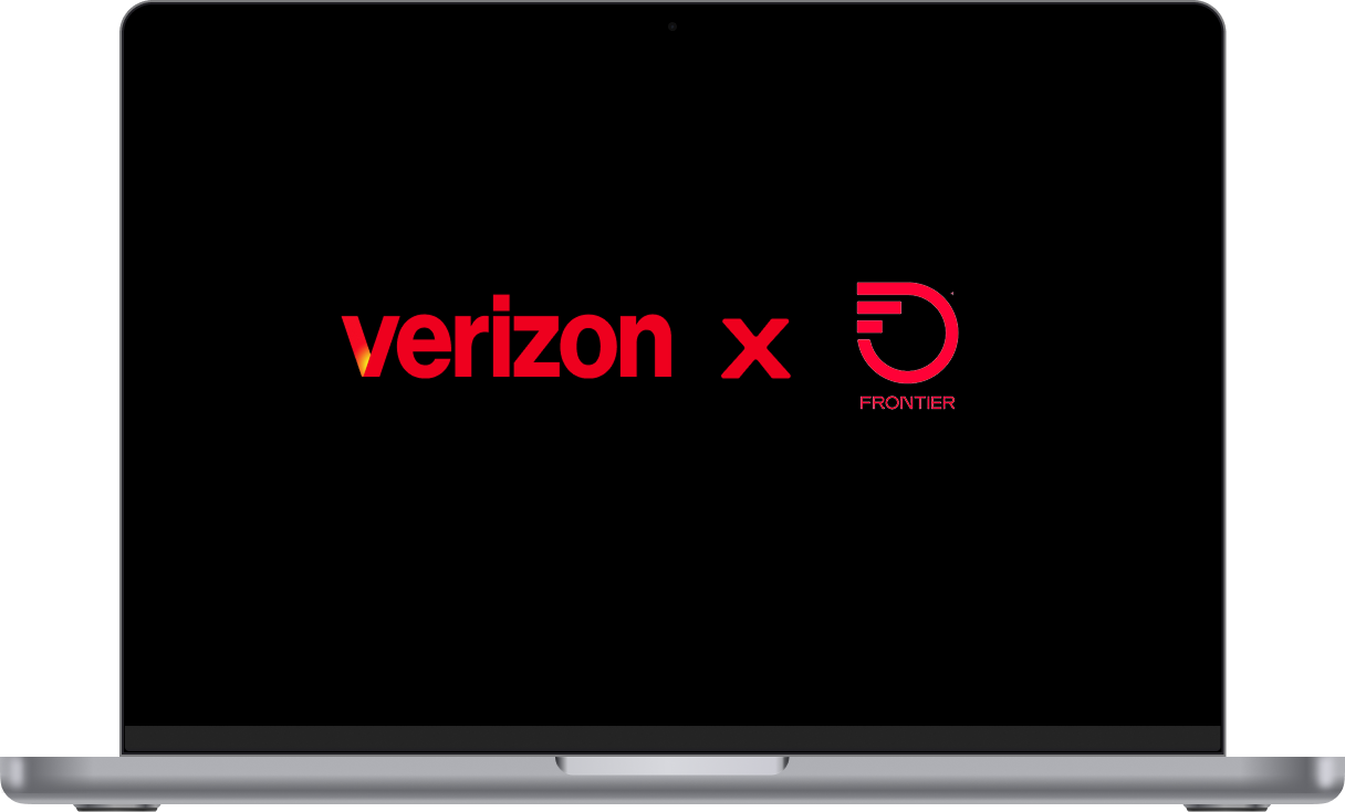
Phase II - Expanding the Bundle Experience (Verizon x Frontier)
Overview
Verizon plans to expand broadband coverage by integrating Frontier Home Internet in areas where FIOS is unavailable. My goal was to ensure that bundle visibility continues seamlessly when a user transitions from Verizon to Frontier broadband coverage.
Duration: 2 months
Tools: Figma · FigJam · Gemini (AI) NotebookLM
Focus Areas: Bundle Visibility · Cross-channel Experience · Ecosystem Integration
Understanding the Channels
I studied how bundle offerings and broadband availability were communicated across Verizon’s major customer touchpoints:
Retail: Store associate-assisted sales flow.
Assisted Channel: Customer care and telesales journeys.
Chatbot Channel: Automated self-service and plan discovery flows.
Each channel had unique visibility gaps and potential points for Frontier integration.
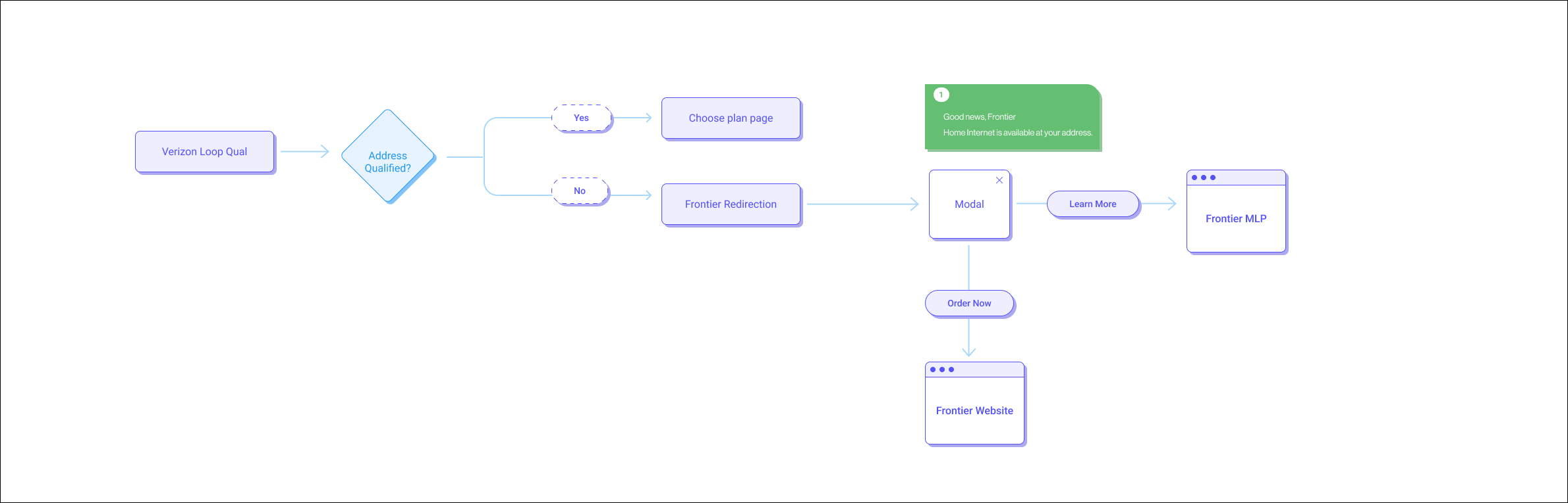
Flow Mapping
I created detailed flow diagrams showing:
How Verizon’s current availability checks work in each channels.
At what stage Frontier broadband could be suggested.
Opportunities to maintain bundle visibility and brand consistency during provider transitions.
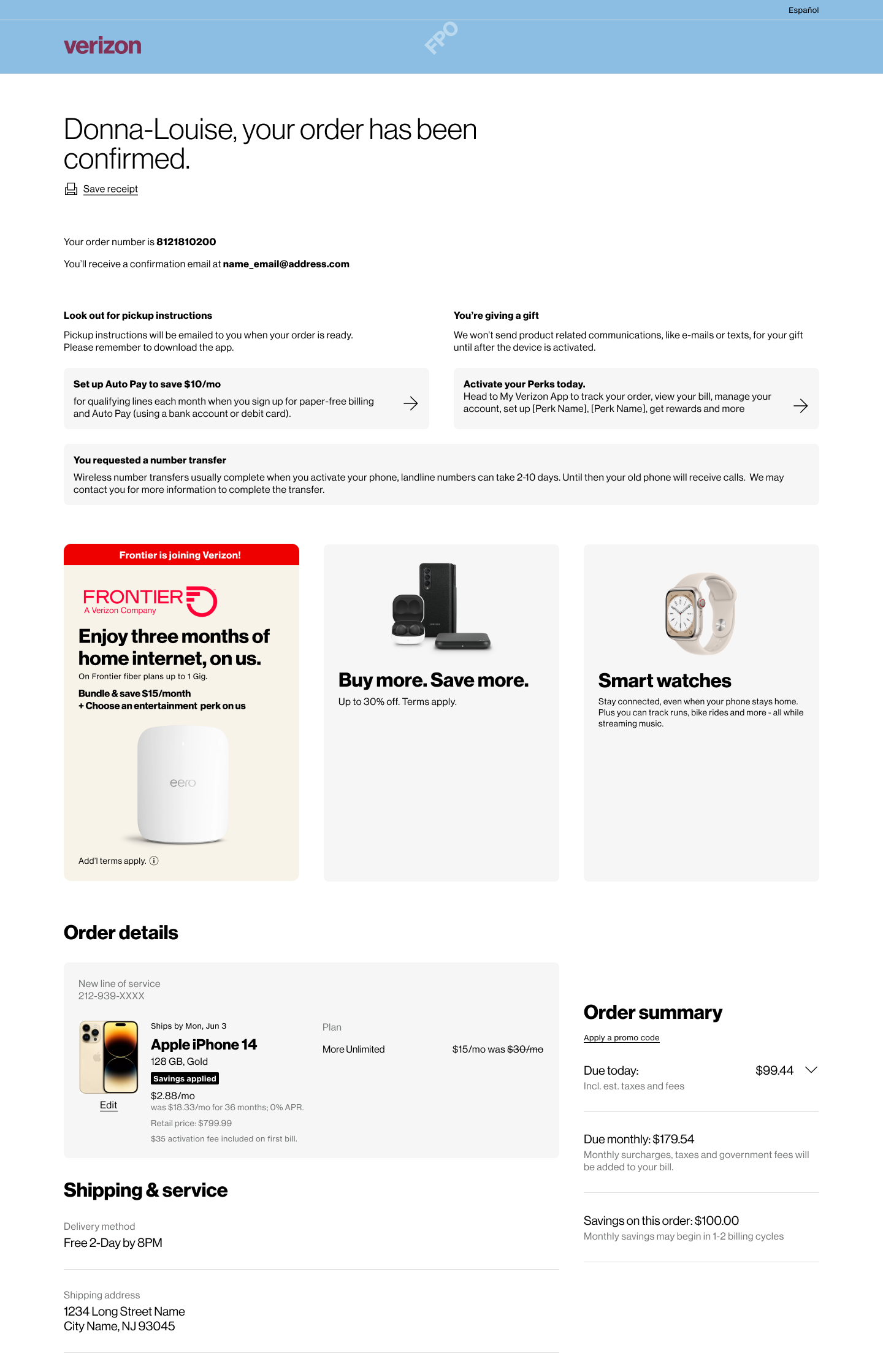
Frontier Opportunity - Digital experience
Frontier Opportunity - VZ Assistant (chatbot) experience

Frontier Opportunity - Retail experience
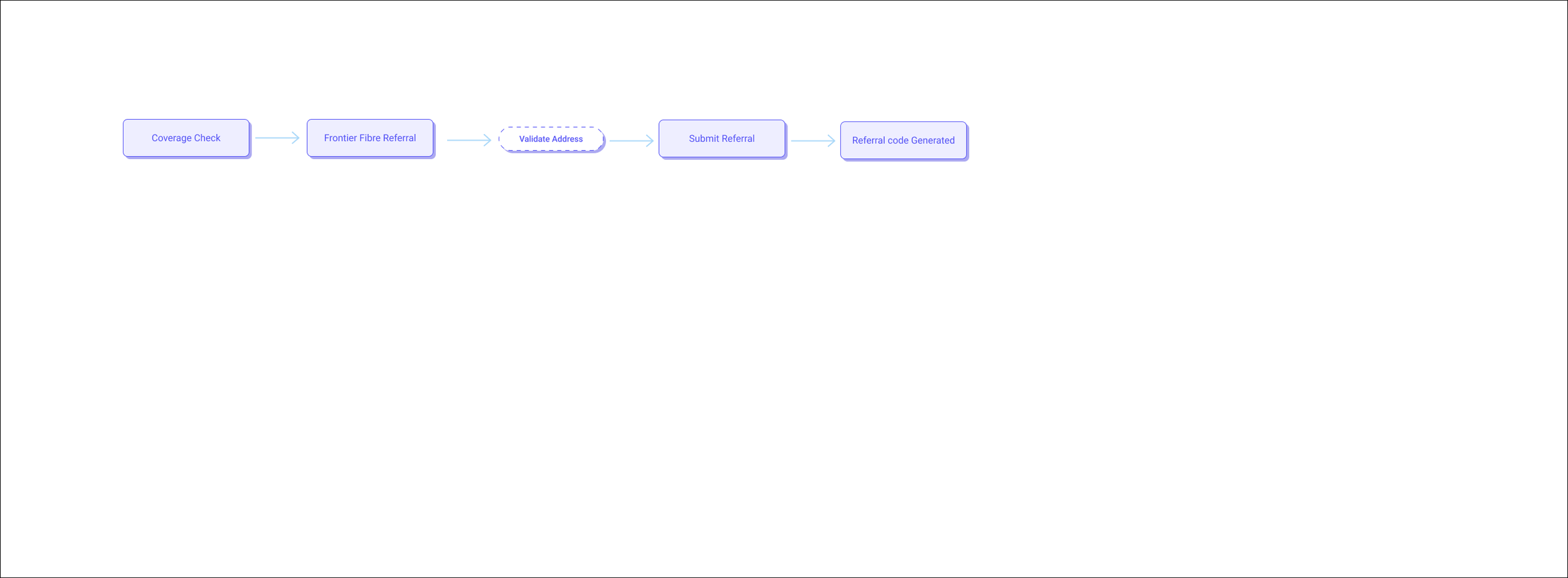
Cross Selling Opportunity
VZ Assistant - Snapshots
Conceptual Enhancements
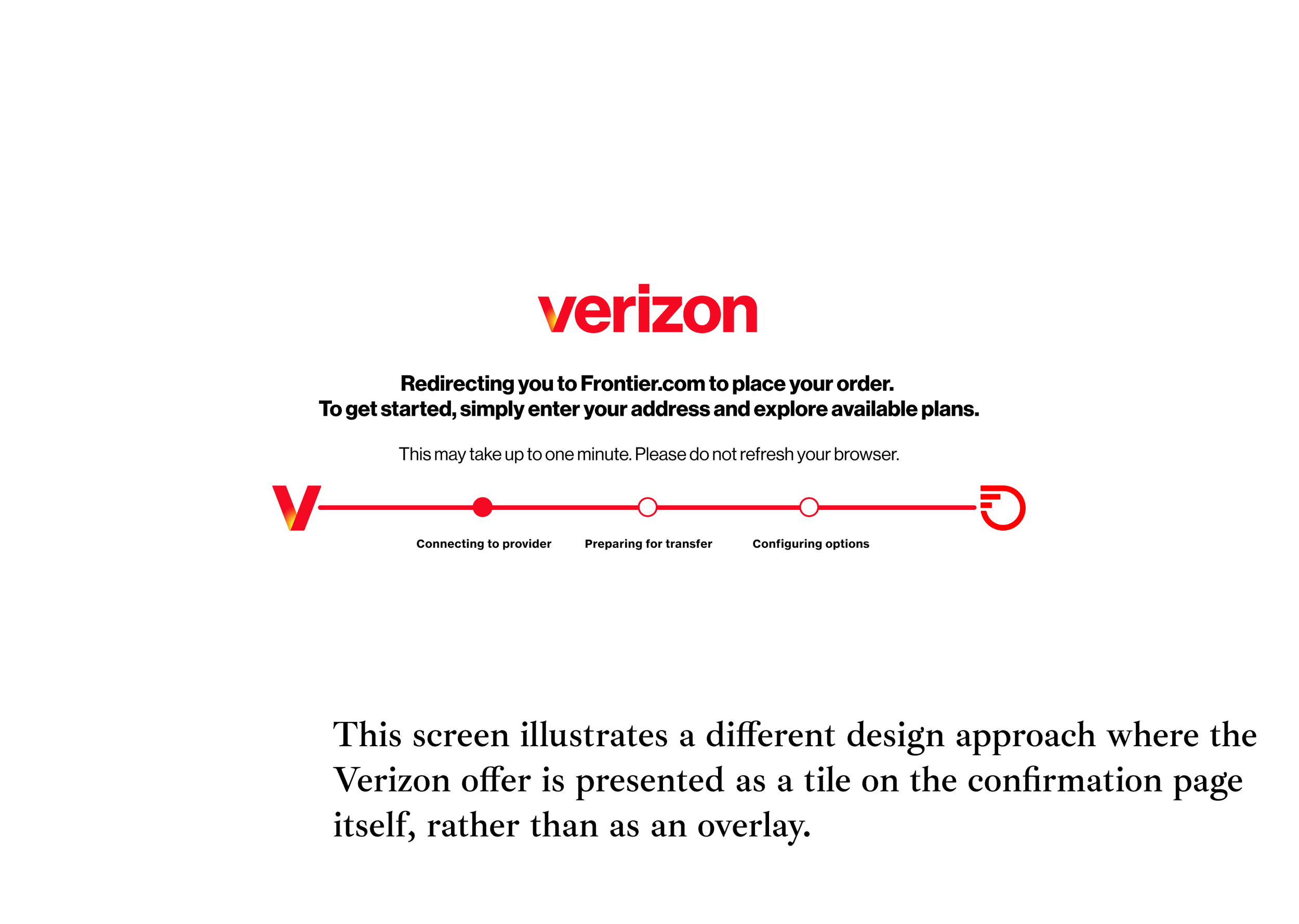


Early Frontier Prompt: Introduce Frontier availability during coverage check with clear, empathetic messaging.
Chatbot Integration: Surface Frontier bundles through smart prompts in chat when Verizon home isn’t available.
Retail/Assisted Support: Equip associates and tools to recommend Frontier-based bundles transparently.
Consistent UX Language: Keep design, tone, and visual cues aligned with Verizon’s brand.
Outcomes
Worked with product managers, researchers, and design leads to align bundle visibility strategy across channels.
Partnered with cross-functional teams to map technical and content dependencies for Frontier integration.
Leveraged AI tools (Gemini, Figma AI) to quickly visualize ideas, personas, and flow diagrams.
This initiative taught me how to design beyond screens — by aligning multiple systems and teams around a consistent user experience vision.