
Project Type : Client Project
Date : Jan 2025 - June 2025
Role : UI/UX Designer
Team : Collaborated with product owners, developers, and stakeholders
Tools : Figma , AdobeXD, Creatie , Protopie , Miro , Figjam , Trello
Brief
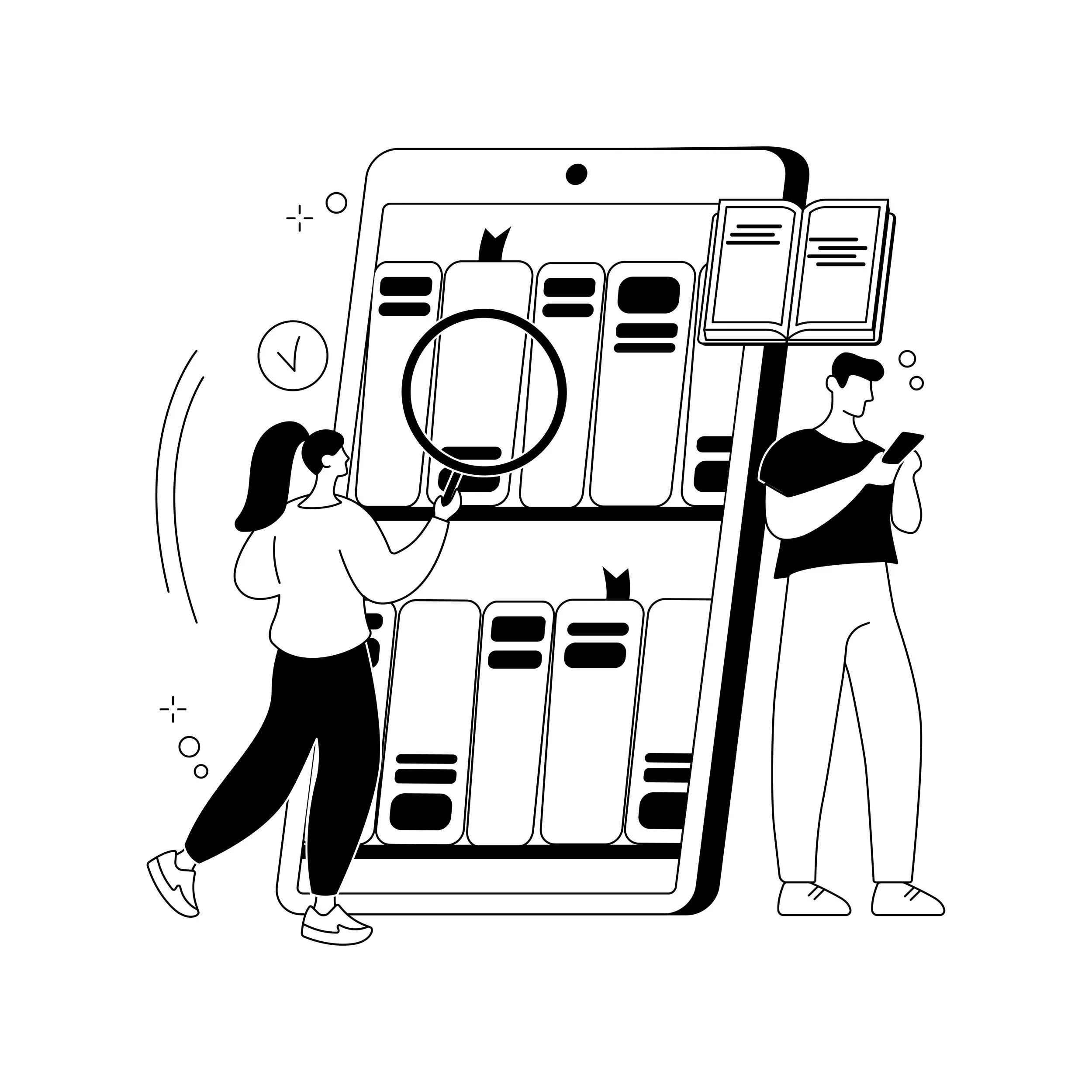
Newspage is a field management app that helps retail representatives plan, track, and complete their store visits easily. While it covered the basic tasks well, the older version had a dated look and was not very user-friendly.
Objective
Nestlé’s internal B2B platform, Newspage v8, was outdated and hindered field representatives’ efficiency. The goal was to modernize the interface, enhance user engagement, and streamline workflows.
Newspage (V8)
How We Started
When Nestlé approached us with the goal of enhancing their internal B2B platform — Newspage v8, it was clear this was more than just a cosmetic upgrade. The platform was actively used by field representatives across India, yet it was failing to meet their day-to-day needs.
Initial Observation
Outdated visual design was leading to disengagement.
The workflow was unintuitive, slowing down field tasks.
Users had to rely on external tools or manual processes to complete orders or check stock status.
Stakeholders shared that the current system wasn’t aligning with their digital transformation vision.

Step One

Conducted kick-off meetings with Nestlé’s internal product and marketing teams to understand goals and expectations.
Established key performance indicators (KPIs) for success.
Created a shared project dashboard on Trello for task management, milestones, and collaboration across teams.
Step Two
We facilitated a goal alignment workshop with all team members to define few points.
This upfront investment helped ensure everyone — from business leaders to developers — shared the same vision for the redesign.

Step Three
User Research & Discovery
To design effectively, we needed to deeply understand how Nestlé’s field representatives interacted with Newspage in real-world environments. We focused on their daily routines, challenges, and goals.
Research Methods
We employed a mix of qualitative and quantitative research:

Our Sample Profile of Participants Include :
12 Field Representatives from 4 regions
3 Regional Sales Managers
2 Internal Trainers who onboard new employees to the platform
Rajesh – On-the-Go Field Sales Rep
Goals: Quickly place repeat orders, check stock, and apply latest offers.
Pain Points: Time wasted on navigating menus, manual entry, missing offer visibility.

Priya – Regional Sales Manager
Goals: Track team performance, identify underperforming stores, view sales reports.
Pain Points: Cumbersome data extraction, no custom dashboards.
Key Insights we synthesized from the Research and Discovery Phase

These insights shaped our direction and helped us prioritize the features that mattered most to the users.
HMW?
How might we create a faster, more intuitive and motivating ordering experience for Nestlé’s field reps that adapts to their on-the-go needs and frequent tasks?
We defined 3 core problem areas:
Time-consuming navigation
Lack of personalization and context-awareness
Low adoption of promotional features
Step Four
From Research to User Stories
After completing our initial research and understanding the user needs, our team transitioned into an agile development process.
Instead of traditional problem statements, we received well-documented user stories and acceptance criteria directly from our Product Owners, who were in close contact with the client.
These user stories outlined the core functionality expected by the client and reflected the real-world challenges of our end users.

How It Worked ?
Agile development process overview
📋 Detailed user stories in sprint planning
• Product Owner shared detailed user stories during sprint planning meetings and on JIRA.
• User stories were a key part of the planning process.
Heads up: AI outputs can be misleading, or even flat-out wrong.
✔️ Acceptance criteria for each story
• Each story had clear acceptance criteria to define expected outcomes and edge cases.
📝 Transforming requirements into UI/UX solutions
• Stories were reviewed and discussed with the team to create thoughtful UI/UX solutions.
• Requirements were carefully transformed into user-friendly designs.
Why This Was Effective ?

Collaborative Execution
Once design drafts were created, I shared them in Figma for internal feedback and walkthroughs with the developers and testers. Additionally, the PO collected feedback from the client to ensure the designs aligned with expectations.
This Approach Insured
Continuous feedback from the team and stakeholders
Early visibility and validation of designs before development
Quick iteration cycles in line with the sprint goals

This method helped us:
Stay aligned with both user needs and business goals
Reduce rework during development
Deliver solutions faster with better clarity
“So, I began by mapping these stories into UX problems and started wireframing solutions. I explored different layouts through techniques like Crazy 8s, then narrowed it down into structured, component-based wireframes. I also conducted internal reviews and design workshops with the team using Miro to validate ideas collaboratively.”
Real User Stories That Drove the Design
Feature Deep Dive – Main Menu Redesign
Problem Statement
What wasn’t working in the old menu?
Why did clients request a redesign?
The existing menu lacked visual hierarchy, required multiple taps for key actions, and didn’t support client-specific needs like customizable shortcuts or quick actions (e.g. enabling biometric login). My goal was to create a scalable, modern navigation panel with better personalization and accessibility.”
My Role and Approach
As the UX Designer on the team, I worked within an Agile environment alongside Product Owners and Developers. The POs collected real user needs directly from clients and translated them into user stories and acceptance criteria, which became the foundation of the redesign.


Key Enhancements (Based on 7 User Stories)

Here you can see the evolution of the design — from the old cluttered menu to a cleaner, card-based layout. I introduced:
Customizable shortcut tiles
Theme and language indicators
Tap-to-call support numbers
Clear sectioning of menu items
And quick actions like enabling biometrics on the fly.”_
“What made this project special was that every screen I worked on was directly tied to a user story — and every solution I implemented was reviewed with both the internal team and clients.”
“In the end, we delivered a scalable, modern, and accessible menu interface that worked across multiple client environments and received great feedback for ease of use and visual clarity.”
Other User Centric Improvements or Additional UX Enhancements
Aside from the Main Menu redesign, I handled UX revamps in several other modules that were lagging in usability or clarity. Each of these had its own user stories shared with us by product owners, and I worked in agile sprints to design, test, and deliver clean, user-centered improvements — quickly and collaboratively.
Case: Store Notes – New UX Feature
Problem:
Sales teams needed a way to create and manage store-specific notes, view them by route, and be reminded of open tasks during store visits.
As part of the UX enhancement process, the Store Notes module was identified as a new feature requirement to streamline internal communication for field sales personnel.
Flow Overview
This feature allows users to:
Access notes from two paths:
From My Store Landing
From the Customer Dashboard
Add new notes
Edit or review existing ones
Encounter special behaviors like:
Scrolling through multiple entries
Editable vs non-editable states based on context
Empty state handling
Navigating from My Store(Alert)
Flow Walkthrough - Accessing store note from MyStore page ( when Alert is shown)
The user lands on the My Store screen.
Taps on a specific store > navigates to Store Note Details.
Can only view if the note is recent or allowed.
Design Decisions
After several rounds of ideation, design iterations, and feedback sessions, we conducted a final collaborative discussion with the product team to align on the expected functionalities and user interactions. The outcome of this session was a refined and actionable summary of requirements, broken down into specific scenarios, user stories, and UX expectations.
The table below outlines the finalized user requirements and design considerations discussed and agreed upon with the product team:

Navigating Store from customer dashboard.
Navigating from Customer Dashboard
The user enters through the Customer Dashboard.
From the landing page, they choose a store, go to Store Note Details, and then either:
Add New Note using the “Add Note” button
Or tap into existing ones and can edit the status and delete the note if want to.

Additional Key Contribution
Revamping Login and Dashboard Module
Challenges with Older Version
Visual Clutter: Overcrowded layout and lack of hierarchy.
Outdated UI: No visual consistency; old-fashioned graphics.
Low Trust: Basic login flows without modern security layers like biometric login or multi-factor authentication.
Poor Dashboard Insights: Limited actionable information shown right after login.
New Design Approach
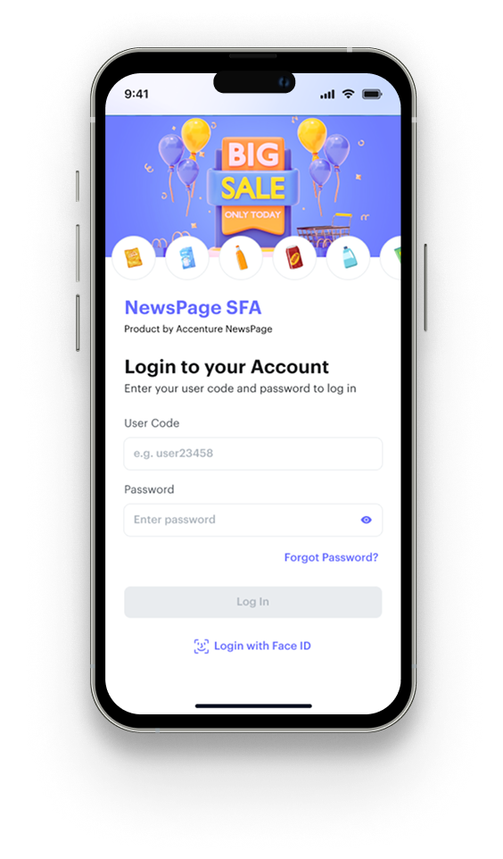

Modern, Clean UI: Introduced white space, consistent typography, and vibrant illustrations at the entry points.
Biometric Login: Integrated options like fingerprint authentication and Face ID to boost user trust and simplify login.


Interactive Dashboard: Quick insights like “Focus of the Day,” “Performance Metrics,” and “Gamification Rewards” right on the home page.
My Store Module - Old Design

New Design Approach


Cleaner landing with improved sorting & filtering options.
New feature: Inline Sort & Filter directly on landing screen (Dropdown + Modal).
Streamlined missed flow (store-specific and bulk action made smoother).
Landing Page : Basic list view with tabs (Day View, Missed, All Stores).
Store Cards : Less informative, only basic details visible.
Actions (3-dots Menu) : Limited actions per store.
Map View : Standalone view.


New feature: Richer Store Cards — includes tags, more quick info (e.g., Missed, Scheduled).
New feature: Expanded action options (Ask NBA, Record Missed) from store card itself.
Slight improvements - clear view and visually enhanced
Impact Created

What I Learned
Direct conversations with users brought priceless feedback early.
Building micro-interactions (like login animation or gamification progress) hugely impacts user emotions and app “stickiness.”
Benchmarking competitors is useful, but tailoring based on our user testing was the real winning move.