Exploration 1:

Improving Visibility and Relevance of Bundle Services

Project Overview:

Verizon’s website already offered bundle options combining Mobile + Home Internet services, but internal studies showed that users often failed to notice or understand the value of these offers.

My role was to explore how to increase the visibility of bundle options and integrate user insights from CMI research to make the offers more meaningful and personalized.

Project Type
Client Project

Role
Senior UI/UX, Website & Mobile App Design , UX Research

Date
July 2025 - ongoing

Tools
Figma, Fig jam, Sharepoint, Miro, JIRA, Developer Tool, Gemini(AI) , Google Vids

Focus Area
Enhancing the discoverability and user alignment of Verizon’s Mobile + Home Internet bundles

Objective:

To enhance the visibility and clarity of bundle services across key customer touchpoints and ensure that the design aligns with real user motivations and expectations uncovered during research.

Research Foundation

We analyzed findings from CMI studies and customer behavior reports to uncover:

  • Users often discovered bundles too late in their journey.

  • They needed clearer communication on benefits, savings, and relevance.

  • Many users wanted personalized recommendations instead of generic offers.

Using these insights, I created data-driven personas (with Gemini-based video representations) that helped stakeholders understand user needs and pain points more vividly.

Exploration: Making Bundle Offers More Visible

Based on research findings, I explored conceptual solutions to make bundle information more discoverable and user-relevant across the website journey.

Homepage Visibility

Problem: Bundle messaging appeared in rotating banners that users easily skipped.

Idea: A dedicated static section on the homepage highlighting bundle benefits with a clear CTA.


Choose your plan - stepper 1

Review Order - Stepper 2

  • Clear concise message that immediately communicates the missed opportunities(if not bundled) or reinforces the smart choice (if already bundled).

  • A distinct button or link to either “Add Mobile & Save” or “View Bundle Details,” which could potentially trigger a modal or redirect to a dedicated bundling flow.

  • Using a contrasting background (like Verizon red, as before) to draw attention.

MLP (Main Landing page)

Problem: The Mobile + Home Internet bundle landing page (MLP) displayed limited information and lacked visual clarity about combined offers and benefits.
Users struggled to understand why bundling mattered and how they could explore both services together.

Idea: Enhancing the MLP design to present all bundle-related details in a structured, engaging format.


Bundle-Relevant Imagery : The image on the right side of the hero now clearly depicts a phone and wifi router, directly communicating the mobile+home internet bundle.

Concise punchy headline : The main headline in the hero banner has been simplified to be more direct and impactful, conveying the core bundle value proposition quickly.

More engaging and Illustrative icons: The icons for each reason are custom and more visually descriptive, making the benefits easier to understand at a glance.

Larger scannable text : The text within each benefit card has increased in size, improving readability and making key benefits easier to digest quickly.

Plan Details Page Context Problem

Problem: Bundle Not Prominent During Plan Selection. When users explored individual mobile or home plans, bundle information was not visible at decision points, causing them to miss potential savings.

Idea: Dedicated Bundle card (a highly visible, distinct plan card or a prominent banner above the single service plans) dedicated solely to bundle.

UX Enhancement for Bundles - Checkout - stepper 3


Option A : Prominent “Unlock More Savings!” Banner.

Maximum Visual Contrast : The bundle card should be having a contrasting background color (e.g. Verizon Red instead of white) and a best value badge

Highlighting the Total savings : Stating the financial benefits clearly, e.g. “save XX/mo. on your total bill if you bundle. Using large bold fonts for visibility.

Option B: Alternative Suggestions -Integrated Bundle Offer in Order Summary

  • Clear concise message that immediately communicates the missed opportunities(if not bundled) or reinforces the smart choice (if already bundled).

  • A distinct button or link to either “Add Mobile & Save” or “View Bundle Details,” which could potentially trigger a modal or redirect to a dedicated bundling flow.

  • Using a contrasting background (like Verizon red, as before) to draw attention.

  • A Subtle Nudge

  • The persistent savings tracker at the top : This is a subtle, high-visibility area.

  • A very concise, text-based prompt near a relevant form field.

  • This keeps the visual clutter to an absolute minimum while still providing a clear call to action for those who are interested. It’s a pull rather than a “push” approach.

Collaboration

I collaborated closely with UX leads, product managers, and developers to:

  • Share persona insights and early design suggestions.

  • Align business goals with user expectations.

  • Use AI tools (Gemini, Figma AI) to quickly visualize ideas and personas.

Outcome

  • Helped bridge research findings with design direction, ensuring bundle communication aligned with real user needs.

  • Provided strategic concepts that guided visibility improvements for bundle services.

  • Strengthened stakeholder empathy through video personas and journey insights.

This project taught me that even subtle visibility improvements can drive major impact when guided by real user insights.

Exploration 2 :

Expanding the Bundle Experience (Verizon x Frontier)

Project Overview

Verizon plans to expand broadband coverage by integrating Frontier Home Internet in areas where FIOS is unavailable. My goal was to ensure that bundle visibility continues seamlessly when a user transitions from Verizon to Frontier broadband coverage.

Role: Senior UI/UX Designer

Duration: Sept 2025 – Present

Tools: Figma · FigJam · Gemini (AI) NotebookLM

Focus Areas: Bundle Visibility · Cross-channel Experience · Ecosystem Integration

Understanding the Channels

I studied how bundle offerings and broadband availability were communicated across Verizon’s major customer touchpoints:

  • Retail: Store associate-assisted sales flow.

  • Assisted Channel: Customer care and telesales journeys.

  • Chatbot Channel: Automated self-service and plan discovery flows.

Each channel had unique visibility gaps and potential points for Frontier integration.

Flow Mapping

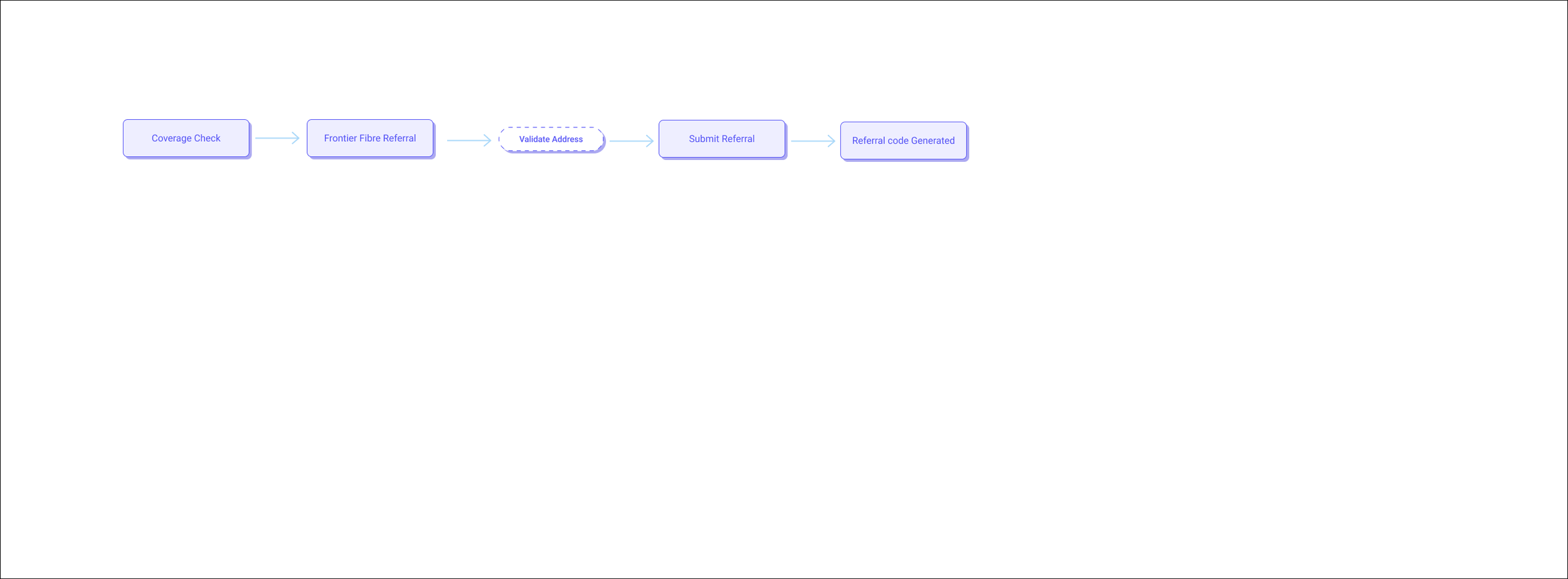
I created detailed flow diagrams showing:

  • How Verizon’s current availability checks work in each channels.

  • At what stage Frontier broadband could be suggested.

  • Opportunities to maintain bundle visibility and brand consistency during provider transitions.

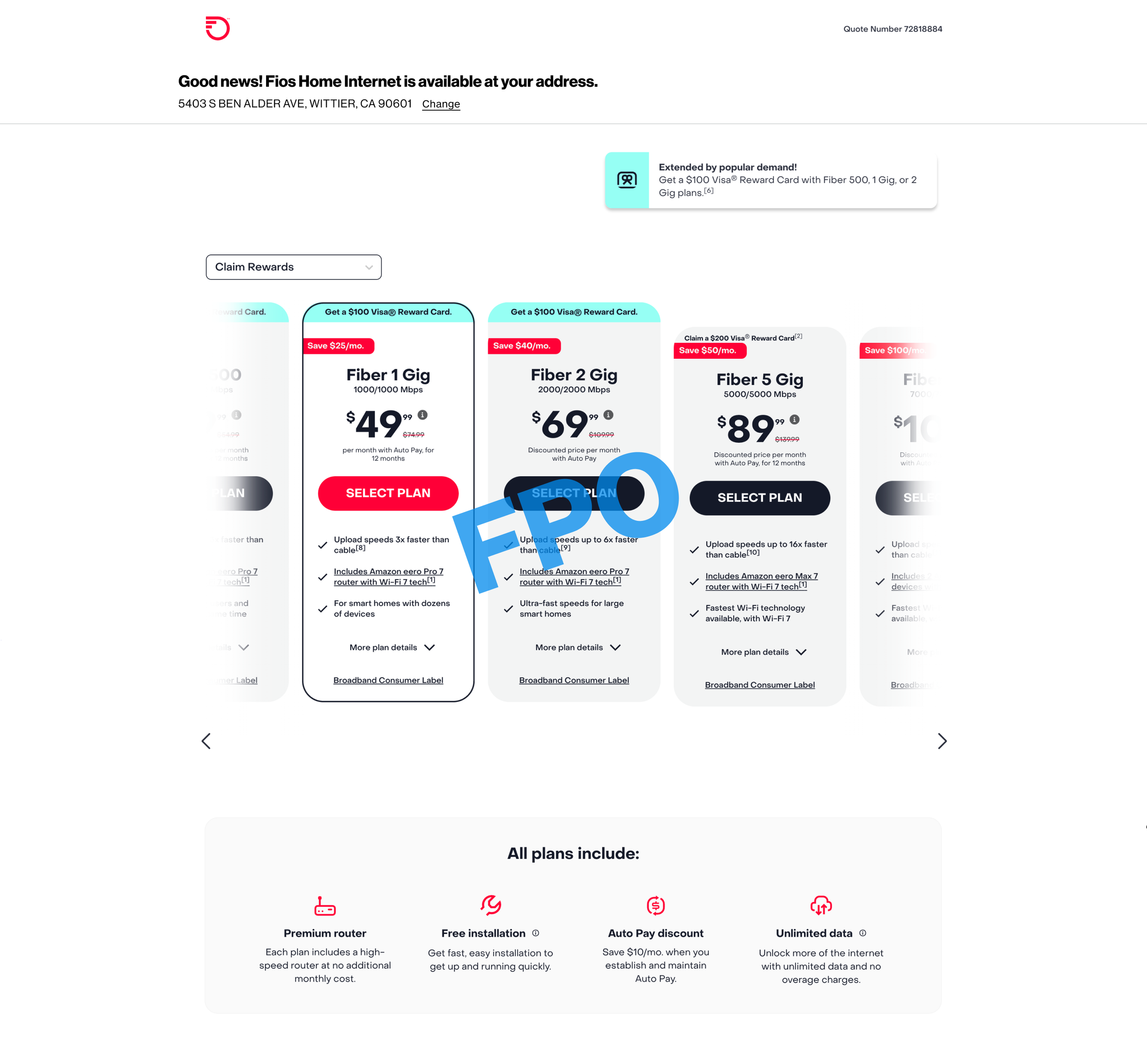
Frontier Opportunity - Digital experience

Frontier Opportunity - VZ Assistant (chatbot) experience

Frontier Opportunity - Retail experience

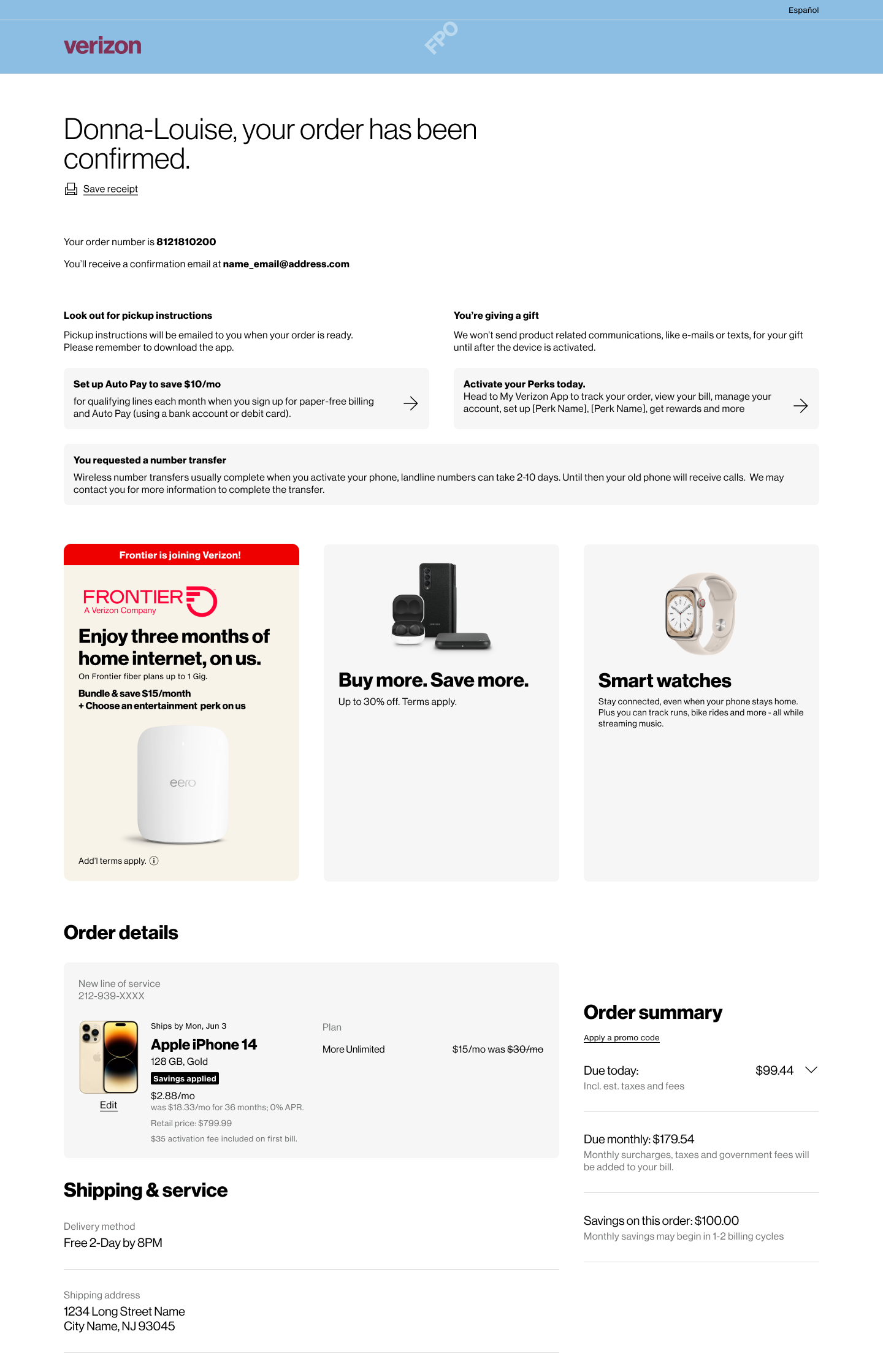
Cross Selling Opportunity


VZ Assistant - Snapshots


Conceptual Enhancements

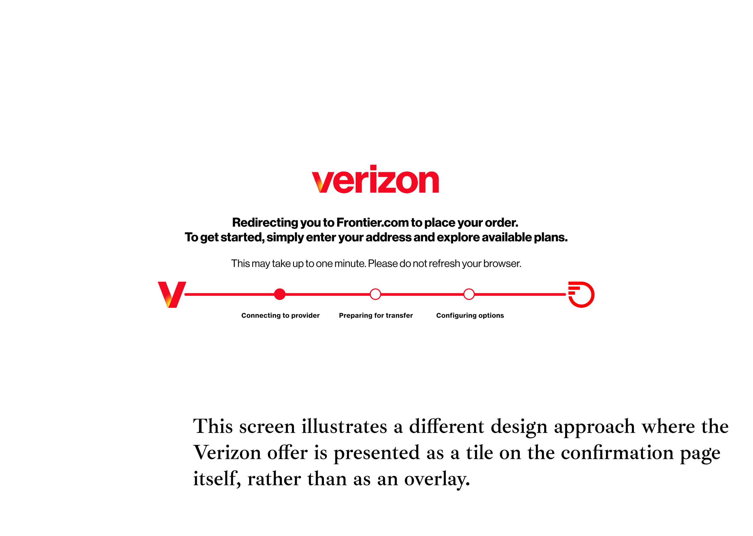
  • Early Frontier Prompt: Introduce Frontier availability during coverage check with clear, empathetic messaging.

  • Chatbot Integration: Surface Frontier bundles through smart prompts in chat when Verizon home isn’t available.

  • Retail/Assisted Support: Equip associates and tools to recommend Frontier-based bundles transparently.

  • Consistent UX Language: Keep design, tone, and visual cues aligned with Verizon’s brand.

Collaboration

  • Worked with product managers, researchers, and design leads to align bundle visibility strategy across channels.

  • Partnered with cross-functional teams to map technical and content dependencies for Frontier integration.

  • Leveraged AI tools (Gemini, Figma AI) to quickly visualize ideas, personas, and flow diagrams.

Outcomes

  • Worked with product managers, researchers, and design leads to align bundle visibility strategy across channels.

  • Partnered with cross-functional teams to map technical and content dependencies for Frontier integration.

  • Leveraged AI tools (Gemini, Figma AI, NotebookLM) to quickly visualize ideas, personas, and flow diagrams.

This initiative taught me how to design beyond screens — by aligning multiple systems and teams around a consistent user experience vision.